Most applications need to identify and authenticate users. Instead of having our own user creation and authentication mechanism, we’ll integrate with one of the social sign-ins. We’ll only implement one (Google Sign-In for Websites); this will serve as a good example for other integrations since it uses the OAuth2 mechanism, which most other authentication integrations also use.
Now, we’ll only focus on the integration, and leave the actual access control and session tracking to the next section. Eventually, we’ll make it so that users can view all information without signing in, but in order to make any change, they will have to sign in. We’ll use a Modal dialog that lets the user sign in with Google from anywhere in the application. Once signed in, the application will let the user stay on the same page to perform the edit functions after signing in.
In the recommended method for integration, the library itself renders the button and handles its enabled and signed-in states. Unfortunately, this doesn’t work well with React because the Google library needs a handle for the button and needs it to be permanent.
If you try to use the button within a React-Bootstrap modal, the library throws up errors since on closing the modal the button is destroyed and recreated when the modal is opened again. The library apparently doesn’t like this. So, we must display the button ourselves by following the guide titled Building a button with a custom graphic.
As a preparatory measure, we need a Console Project and a Client ID to identify the application. Please follow the guide’s instructions to create your project and client ID.
To use the client ID, we’ll store it in a configuration file that will be required during runtime, but one that we cannot commit as part of the source code or include in any bundle during compilation. This is because we’d like the file to be changed after deployment, and the contents can be different for different deployments like development, staging, and production. Since this configuration will only be used in the client, we can simply create a JavaScript file in the static directory with the configuration parameters and include that in the index.html that is generated. The configuration file name is simply config.js. A sample configuration is available in the GitHub repository accompanying this book as config.sample.js, and the contents should be as the below code with the text “YOUR_CLIENT_ID” replaced by the client ID you generated in your project.
config.js:
window.config = {
 googleClientId: YOUR_CLIENT_ID.apps.googleusercontent.com',
};
config.js is a Runtime Configuration File with the Client ID.
We’ll use this configuration parameter in a new component that encapsulates the entire sign-in and sign-out functionality. Just like we did for Create Issue, we’ll encapsulate this inside a NavItem. When the user is signed in, we’ll show a drop-down menu with the user’s name and a menu item to sign out. When not signed in, we’ll instead, show a navigation item that lets the user sign in.
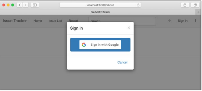
We’ll initialize the authentication engine within componentDidMount, as it will be called only once since the component is in the header and always visible. Upon clicking the Sign In navigation item, we’ll show a modal dialog, with a single button for Google Sign-In. I used an image as per the branding guidelines found in the Google Sign-In developer guide within this button. For testing, you may use a plain button, but if you intend to put the application in production, you should follow the branding guidelines.
Upon clicking this button, we’ll call the auth2.signin() method. This method is not described in the guide, but you can find a description in the Reference” section. On a successful sign-in, we’ll call a callback with the name of the user to the parent component, since this information will eventually have to flow down into all components that will need the user information. This component, too, will need the information on the signed-in state and the name of the user to determine the navigation item to display. The contents of the new component should be as below.
SignInNavItem.jsx:
import React from 'react';
import { NavItem, Modal, Button, NavDropdown, MenuItem } from
'react-bootstrap';
export default class SigninNavItem extends React.Component {
constructor(props) {
super(props);
this.state = {
showing: false, disabled: true,
};
this.showModal = this.showModal.bind(this);
this.hideModal = this.hideModal.bind(this);
this.signout = this.signout.bind(this);
this.signin = this.signin.bind(this);
}
componentDidMount() {
window.gapi.load('auth2', () => {
if (!window.gapi.auth2.getAuthInstance()) {
if (!window.config || !window.config.googleClientId) {
this.props.showError('Missing Google Client ID or config file
/static/config.js');
} else {
window.gapi.auth2.init({ client_id: window.config.googleClientId
}).then(() => {
this.setState({ disabled: false });
});
}
}
});
}
signin() {
this.hideModal();
const auth2 = window.gapi.auth2.getAuthInstance();
auth2.signIn().then(googleUser => {
fetch('/signin', {
method: 'POST',
headers: { 'Content-Type': 'application/json' },
body: JSON.stringify({ id_token: googleUser.getAuthResponse().
id_token }),
}).then(response => {
if (response.ok) {
response.json().then(user => {
this.props.onSignin(user.name);
});
} else {
response.json().then(error => {
this.props.showError(`App login failed: ${error}`);
});
}
})
.catch(err => {
this.props.showError(`Error posting login to app: ${err}`);
});
}, error => {
this.props.showError(`Error authenticating with Google: ${error}`);
});
}
signout() {
const auth2 = window.gapi.auth2.getAuthInstance();
fetch('/signout', {
method: 'POST',
headers: { 'Content-Type': 'application/json' },
}).then(response => {
if (response.ok) {
auth2.signOut().then(() => {
this.props.showSuccess('Successfully signed out.');
this.props.onSignout();
});
}
});
}
showModal() {
if (this.state.disabled) {
this.props.showError('Missing Google Client ID or config file /static/
config.js');
} else {
this.setState({ showing: true });
}
}
hideModal() {
this.setState({ showing: false });
}
render() {
if (this.props.user.signedIn) {
return (
<NavDropdown title={this.props.user.name} id="user-dropdown">
<MenuItem onClick={this.signout}>Sign out</MenuItem>
</NavDropdown>
);
}
return (
<NavItem onClick={this.showModal}>Sign in
<Modal keyboard show={this.state.showing} onHide={this.hideModal}
bsSize="sm">
<Modal.Header closeButton>
<Modal.Title>Sign in</Modal.Title>
</Modal.Header>
<Modal.Body>
<Button block disabled={this.state.disabled}
onClick={this.signin}>
<img src="/btn_google_signin_dark_normal_web.png"
alt="Signin" />
</Button>
</Modal.Body>
<Modal.Footer>
<Button bsStyle="link" onClick={this.hideModal}>Cancel</Button>
</Modal.Footer>
</Modal>
</NavItem>
);
}
}
SigninNavItem.propTypes = {
user: React.PropTypes.object,
onSignin: React.PropTypes.func.isRequired,
onSignout: React.PropTypes.func.isRequired,
showError: React.PropTypes.func.isRequired,
showSuccess: React.PropTypes.func.isRequired,
};
SignInNavItem.jsx is a New Component that is used to handle Google Sign-in
We expect the property user to be an object that has the keys signed In and name. These keys let us choose between showing a drop-down or a navigation item in the render() method. As a precautionary measure, we also disabled the login button until the initialization has completed, and if it has failed, we show an error (it is very likely that on a fresh deployment, someone will miss the configuration file for the Google Client ID). Also, we’re expecting a sign in and a sign out handler, as well as functions for showing success and error as part of the properties.
The gapi functions are available as part of Google’s platform library, which we will include as part of the index.html template. This change is shown below.
template.js:
...
 <script src="https://apis.google.com/js/api:client.js"></script>
...
 <script src="/app.bundle.js"></script>
 <script src="/config.js"></script>
...
template.js is used to change Include Google API Platform Library, and Loading the Configuration.
To use the component, we’ll include it in the header, in place of the placeholder that we had until now. Further, we won’t let the header handle the sign-in or sign-out; instead, we’ll pass on the information to its parent, App, so that the user information can be held at the topmost point possible. The changes to the Header component is shown below.
Header.jsx:
...
import { Navbar, Nav, NavItem, NavDropdown, MenuItem, Glyphicon, Col } from
'react-bootstrap';
...
import SigninNavItem from './SigninNavItem.jsx';
...
render()
...
<NavDropdown id="user-dropdown" title={<Glyphicon glyph="option-
horizontal" />}
noCaret>
<MenuItem>Logout</MenuItem>
</NavDropdown>
<SigninNavItem
user={props.user} onSignin={props.onSignin}
onSignout={props.onSignout}
showError={props.showError} showSuccess={props.showSuccess}
/>
...
Header.propTypes = {
...
showSuccess: React.PropTypes.func.isRequired,
onSignin: React.PropTypes.func.isRequired,
onSignout: React.PropTypes.func.isRequired,
user: React.PropTypes.object,
...
Header.jsx is used for making changes in Including Sign-In Navigation Item
The App component will now have to be converted to a stateful component since it will hold the user information and the signed-in state. We’ll also introduce methods to manipulate this state. The new rewritten App component is shown below.
App.jsx:
import 'babel-polyfill';
import React from 'react';
import Header from './Header.jsx';
export default class App extends React.Component {
constructor(props) {
super(props);
this.state = {
user: { signedIn: false, name: '' },
};
this.onSignin = this.onSignin.bind(this);
this.onSignout = this.onSignout.bind(this);
}
onSignin(name) {
this.setState({ user: { signedIn: true, name } });
}
onSignout() {
this.setState({ user: { signedIn: false, name: '' } });
}
render() {
return (
<div>
<Header user={this.state.user} onSignin={this.onSignin}
onSignout={this.onSignout} />
<div className="container-fluid">
{this.props.children}
<hr />
<h5><small>
<a href="https://github.com/vasansr/pro-mern-stack">
GitHub repository</a>.
</small></h5>
</div>
</div>
);
}
}
App.propTypes = {
children: React.PropTypes.object.isRequired,
};
App.jsx is used to rewrite as a Stateful Component to Hold User Information.
The render() method is almost the same, except for passing in the handlers as properties to Header. The effect of these changes can now be tested. The below figure shows the modal dialog. Clicking the button should open a new browser window with your accounts, and if it’s the first time you are signing in, you will also be shown a message asking to grant permissions to the application. Upon successful sign-in, the menu item will be replaced with the first name of the user, which is obtained from the authentication.
If you want to support multiple social sign-ins such as Facebook and GitHub in addition to Google, you’re probably better off using an npm package such as passport, which lets you quickly put together multiple sign-in options. But the passport integration is at the back end and works well if the result of the sign-in doesn’t have to be the same page the user initiates it from. It takes the user through a series of redirects and ends up in a possibly new page as the result of a successful sign-in.
