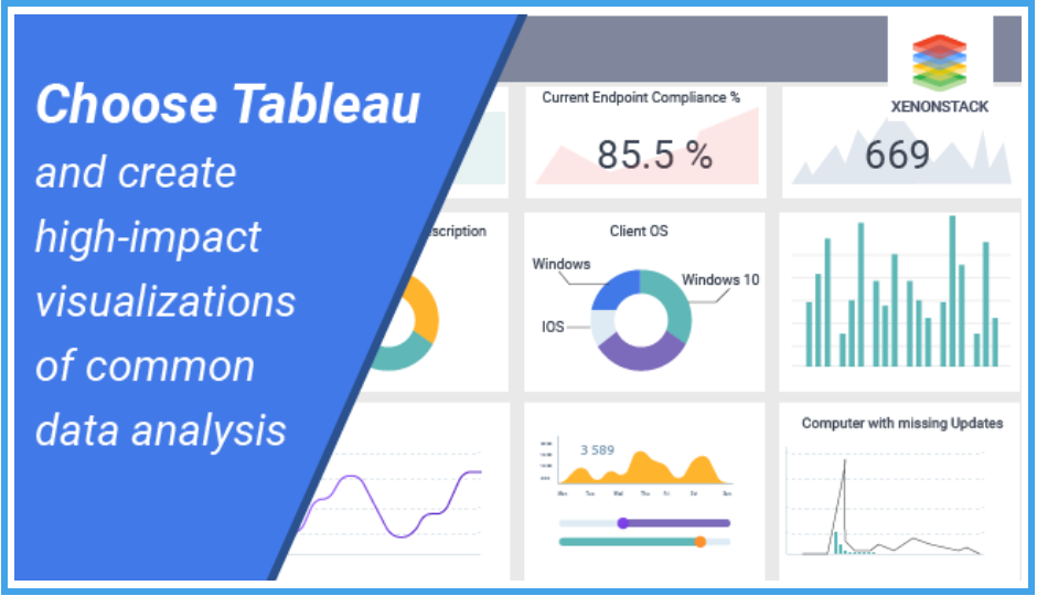
People can comprehend data better through pictures over reading numbers in rows and columns. By visualizing data, one will be able to ask more effectively and answer important questions such as “Where are sales growing,” “What is driving growth” and “What are the characteristics of the customers using different services?” Combine visual analysis with the power of data science, and transform your data from an underutilized asset to a competitive advantage.
What gives tableau an edge over excel?
->Tableau customers regularly claim that tasks that take hours in Excel are completed in minutes in Tableau – typically a 100x productivity improvement. Not to mention the improved quality of results and additional insights that are gained from Tableau’s superior presentation of the data.
->Tableau can access and display unlimited amounts of data. We have customers that analyze 10 billion rows of data. Create pivot tables with an unlimited number of rows, columns, members, and cells. Excel has many limitations in all these areas that confound even simple analysis.
->How much confidence do you have that everything is correct with your data in excel? Did someone delete something or change a value by accident? Do the formulas account for all the data? With Tableau, there is complete safety. The underlying data is not changed, and the formulas are universal – they are always correct, if you make a mistake, simply use the unlimited undo feature. Explore with freedom.
-> The default charts and graphs created by Tableau adhere to best practices in visualization. This means that the formatting, colors, axes and other aspects of the views are already beautiful – there is no need for mass manipulation of the defaults to get a stunning result. Even better, if you decide that ‘E_name’ should be called ‘Employee name’, Tableau will update it everywhere it is used, on every label, axis, legend, and possible place it is presented.
->Excel allows you to plot the results of your analysis but Tableau actually helps perform better analysis. The entire process is visual so you get the benefits of the clean, simple presentation of a chart at every step along the way. This encourages data exploration and allows people to understand the data instead of just presenting a report.
->Simply click on the items that belong together and ‘Group’. Groups can fix data errors (‘emp_name’ and ‘E_name’ and ‘employee name’ should all be the same thing), create new roll-ups (Employee names into names), or segment the data. The best news is that groups are easy to create, modify and completely reusable – even in different workbooks connected to different data!
-> Tableau allows you to package an entire set of analyses – including the process of analysis – into a single file that can be opened with the free Tableau Reader. Arrange the results in a dashboard and provide interactive controls that allow users to sort, filter, drill down or even provide a path for users to navigate through the data to find the cause of interesting points, outliers or other anomalies. All this without programming, macros, writing SQL or anything more than drag and drop, and some occasional typing to provide names for things.
-> Dashboards in Tableau are easy. Just drag and drop the views you’ve built into an interactive workspace. Combine views from different data sources, filter, highlight, and link across multiple views in one dashboard. You can also embed dashboards in a browser or portal like Microsoft SharePoint. The best part is you can take all your analyses, views, and dashboards and reuse them with new data. Simply edit the connection information and point Tableau at the new data and all the analysis is automatically re-run using that new data.
